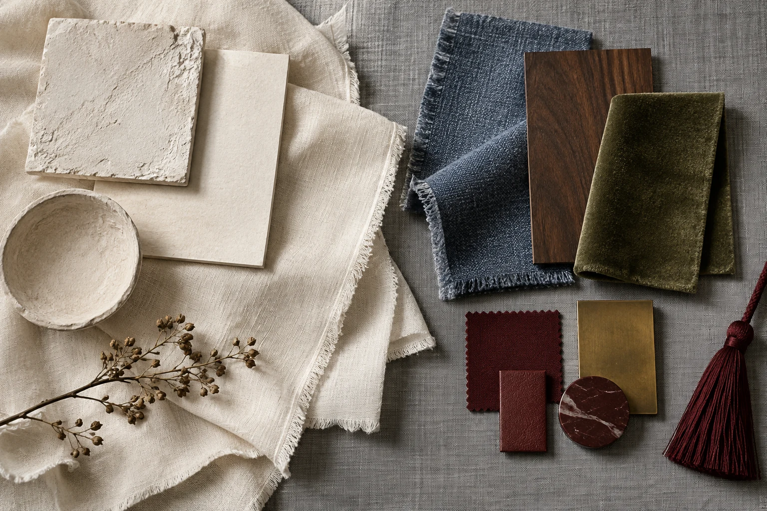
How to pull a whole room out of one piece of art
Read the picture, split the colors, skip the mood board · Checked Sep 20, 2026

By NoraLease and Layer · Checked Sep 20, 2026
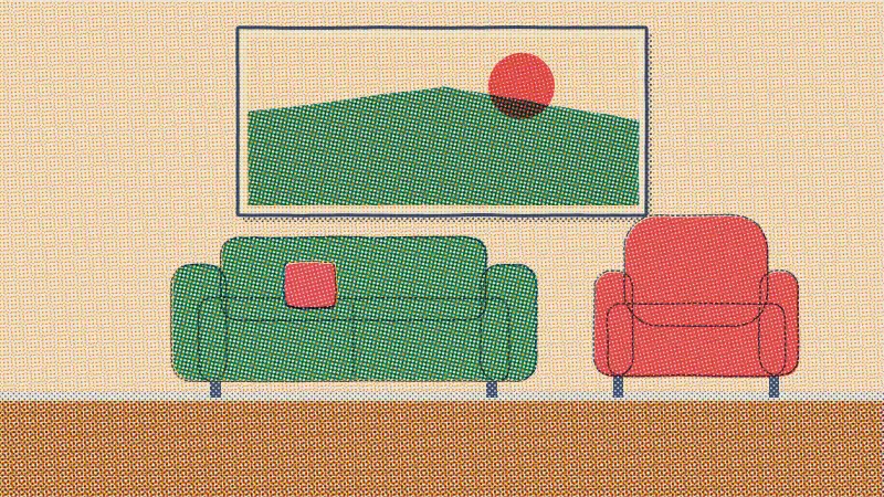
The whole method, in three lines
- Hang the one thing you picked because you liked it A painting, a print, a poster, a rug. It is the only object in the room chosen for no reason except that you wanted it, and that is what makes it a good source.
- Name the three colors that cover the most of it By area, not by taste. Stand back until the detail drops out and write down what is left. Three, no more.
- Give the three colors three different amounts Sixty, thirty, ten. Three colors in equal amounts is a flag. Which color takes which share is the part worth getting right, and the room below will tell you.
In this guide
Take me straight to the eyedropper
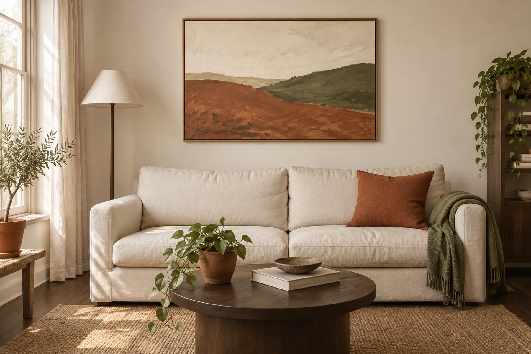
A painting you like has already done the hard part. Somebody spent a long time deciding that those colors sit together, and you can have that decision for the price of hanging it.
Most palettes die in the collecting stage. You save forty pins, and because you saved them one at a time you end up with a rust bedroom, a sage kitchen and a black-framed everything, all of which looked good in isolation and none of which agree. Nothing in that pile tells you how much of each color to buy, so you buy a bit of everything and the room reads as a sample sale.
One object fixes that, as long as the object is one you already chose. A painting, a print, a rug, a tea towel you kept for no reason. It carries a finite number of colors, in fixed amounts, already tested against each other. All you have to do is read it correctly and copy the amounts.
Two parts, then. Reading the picture, which people get wrong by picking their favorite color instead of the biggest one. And splitting it, which people get wrong in a way that is easier to show than to explain, so the page shows it about six hundred words from here.
Reading the picture
Squint at it, and name the three colors that take up the most space

She has been doing this at the picture all morning. It is the method.
Not the three you like best. The three with the most square inches. Your eye wants to pick the little flash of gold in the corner because it is the interesting bit, and the little flash of gold is exactly what will ruin the room if you treat it as a main color.
Photograph it and shrink it to a thumbnail
Take a phone photo of the piece, then look at it as a thumbnail in your camera roll instead of full screen. At that size the brushwork, the texture and the small marks disappear and you are left with three or four blocks of color. Those blocks are the palette. Everything that vanished is detail, and detail does not scale up to a wall.
If you have no piece to photograph yet, do the same thing by stepping back six feet and half closing your eyes. Same result, no phone.
Anything smaller than your hand is an accent
Hold your hand up against the picture at arm’s length. Any patch of color smaller than your palm is not one of the three. It can still come into the room later, but it comes in as one object, not as a scheme.
The exception worth naming, because it is the interesting case: a small patch can be a main color if it repeats. Five little terracotta marks scattered across a picture add up to a real area, and your eye adds them up whether you do or not. One terracotta mark in one corner does not.
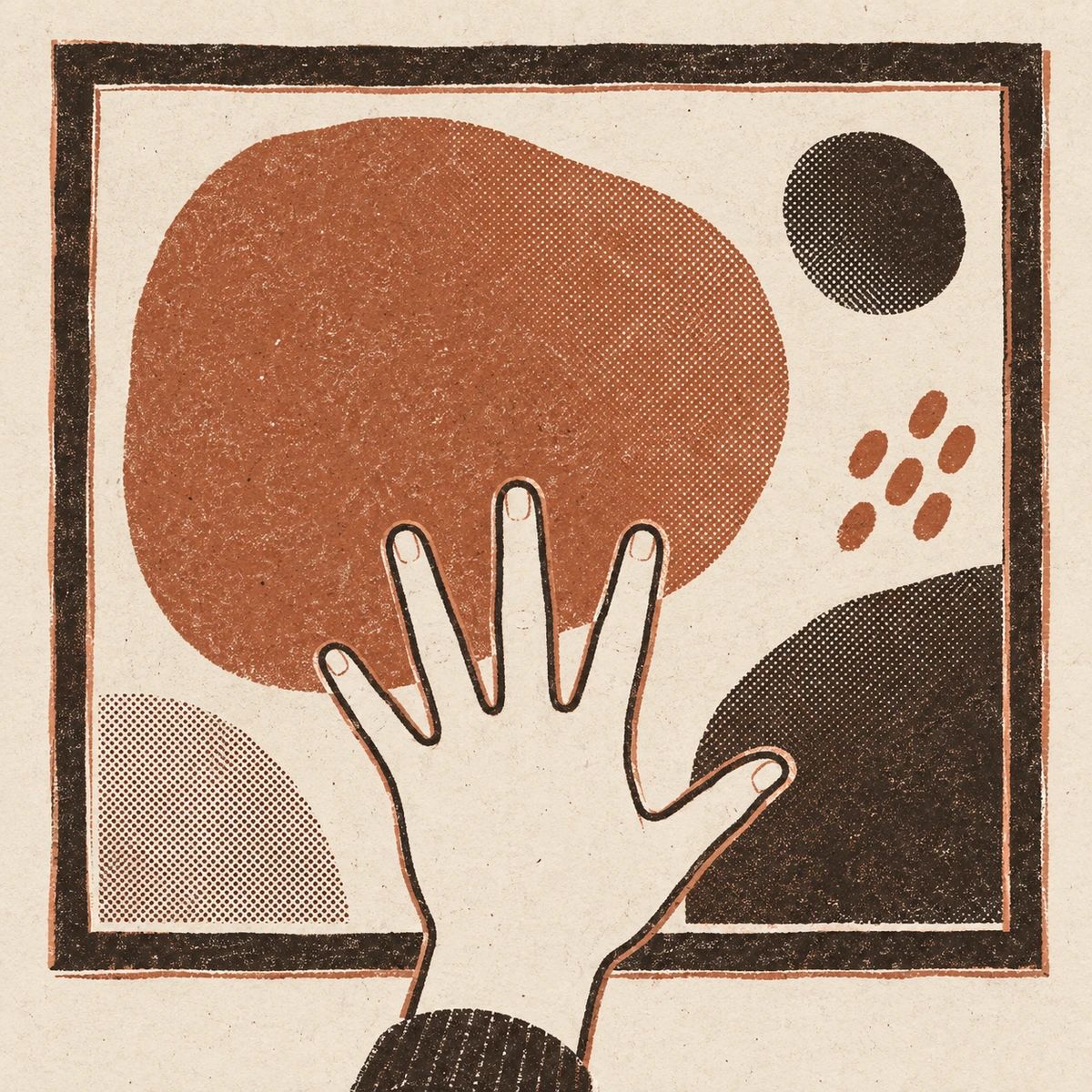
Ignore the frame, the mount and the wall behind it
The frame is hardware. A black frame does not put black in your palette any more than a plug socket does, and people get talked into a black-and-white scheme by a frame somebody else chose at the shop.
Same for the mount board. A wide cream mount makes the picture read paler than it is, so read the image inside the mount, not the rectangle on the wall. If you have already got the three colors and one of them is the mount, you have got two colors.
Try it
Pull three colors out of this painting and put them in a room
Six flat colors, one picture. Pick three. The first one you pick takes sixty percent of the room, the second takes thirty, the third takes ten, and the room on the right repaints itself as you go. Try an obvious one first, then try the one you would never dare.
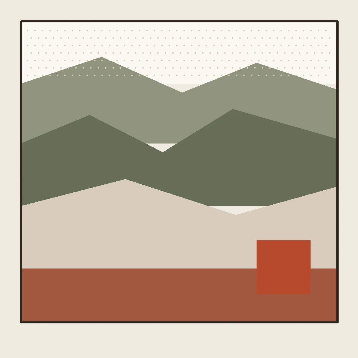
- 01Paper white
- 02Soft olive
- 03Deep olive
- 04Stone gray
- 05Mid clay
- 06Burnt terracotta
The starting split Paper white on the walls, soft olive on the sofa and the rug, burnt terracotta on the armchair, the cushion and the pot.
Tap a slot to empty it. Tap a color twice to take it back out.
What the room just told you
The loudest color in the picture is a ten, and it is a ten in every room you have ever liked
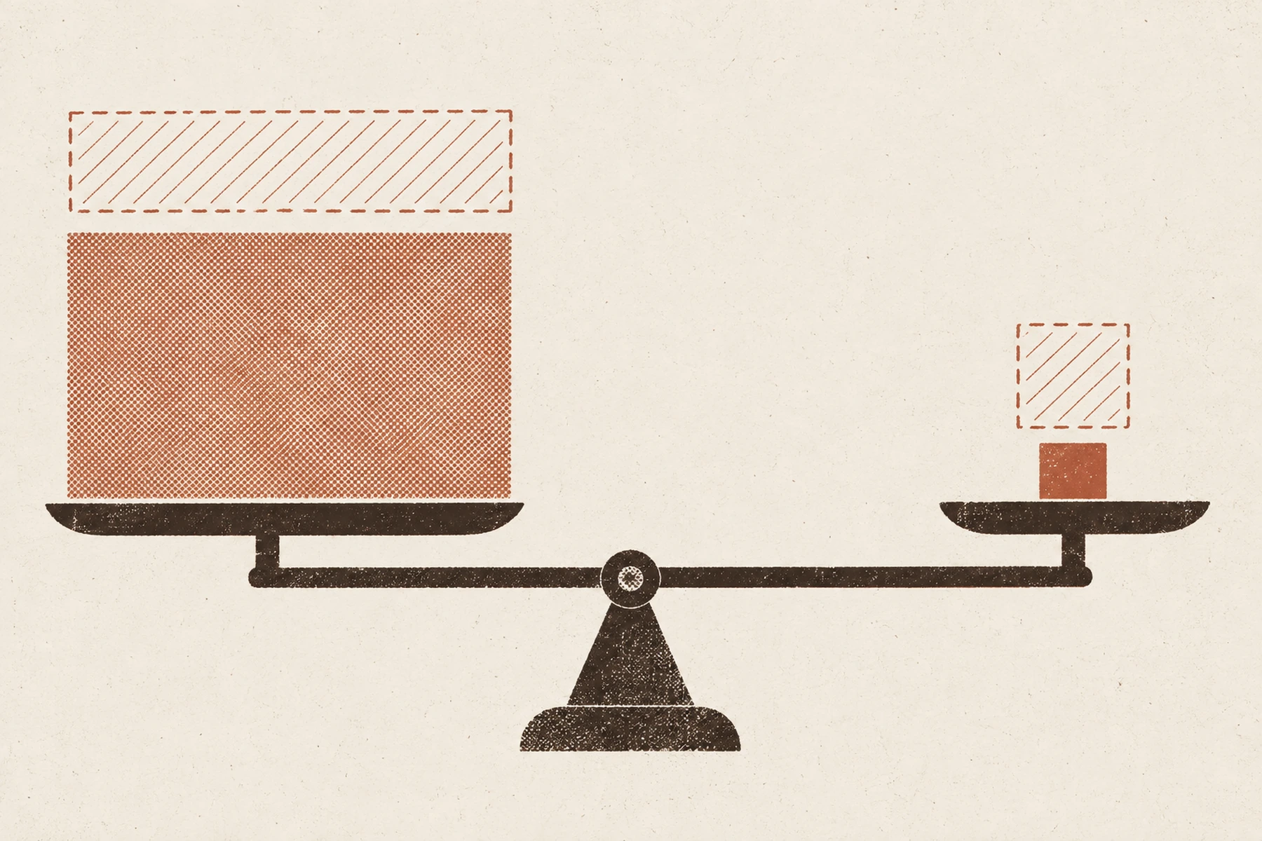
If you gave the strong color the sixty, you saw it: the room stopped being a room and became a color. There is nothing subtle about the failure, which is why it is worth doing on a drawing instead of on a sofa.
The reason is arithmetic. What your eye registers is roughly intensity multiplied by area. A pale color over a wall and a floor comes out around the same weight as one saturated cushion, which is why both can be in the same room without a fight. Put the saturated one on the wall and the floor and nothing else in the room can be heard at all.
So the picture tells you the order as well as the colors, and it tells you by area. The largest area in the painting is the largest area in the room. The smallest strong shape is the cushion. You are copying a split that already works at postcard size.
The exception, in the same breath, because it is real: a deep wall color can carry a room. Every good dark green dining room is proof. But it only works when everything else goes quiet, it needs more light than a rental usually has, and you cannot paint a rental wall anyway. Which is the next section.
| In the picture | In the room | Share |
|---|---|---|
| The biggest, palest areaUsually the ground, the paper or the sky | Walls and ceilingIn a rental this one is decided for you, and that is a relief more often than it is a problem. | 60 |
| The second area, mid depthThe one you notice second | The sofa first, then the rug and the curtainsStart with what you cannot send back. This is the share you buy, and all of it goes in the van with you. | 30 |
| The smallest, strongest shapeThe bit your eye goes to first | One chair-sized pieceAn armchair or a big print in the strongest color. A cushion, a lampshade or a pot can echo it; on their own they are too small to be the ten. | 10 |
The case that is always the case
Your sixty is already painted, and it is landlord off-white

Landlord white. Every unit. She stopped reacting to it years ago.
Almost every version of this advice assumes you will paint. You will not. So the question becomes: what do you do when the biggest color in your picture is not the color of your walls, and repainting is not on the table?
Good news first. If the biggest area in your picture is a warm off-white, a cream or a pale stone, you are done, because that is what rental walls already are. That is the common case, and it is why paintings with a lot of bare ground are the easiest ones to build a room from.
If it is not, here is the order I would try, cheapest and most reversible first.
-
Free to undo
Give the big color the thirty instead
Curtains and a rug are the two largest surfaces in the room you are allowed to touch. A pair of floor length curtains hung wide of the frame covers more of what you see than the wall behind them, and an 8 by 10 foot rug takes most of the floor. Put the big color there, as your thirty, and the wall keeps the sixty as background, which is what a landlord wall wants to be anyway.
Same color, moved off the wall and onto what you are allowed to change. -
Costs nothing
Take the wall out of the palette on purpose
If the wall is a color you cannot use, stop counting it as one of the three and treat it as a frame around the room. Then your three colors live on the furniture, the textiles and the objects, and the wall is the mount board. This sounds like giving up and it is the move that saves most rooms.
-
Deposit risk, low
Paper or limewash one wall, not four
One wall in the big color, behind the sofa or behind the bed, gets you most of the effect for a quarter of the risk and a quarter of the work. Peel and stick paper comes off if you buy the removable kind and prep properly, and a limewash panel is a board you take with you.
One wall behind the sofa, seen from above. The other three stay out of it. -
Honest
Pick a different picture
The unglamorous answer, and sometimes the right one. If your painting is mostly deep green and you have white walls and one north window, the room is never going to look like the painting. You can hang it anyway because you like it, and build the room from something else. Liking a piece and building a scheme from it are two separate decisions.
If you do not own any art
Where the picture comes from, and how big it has to be
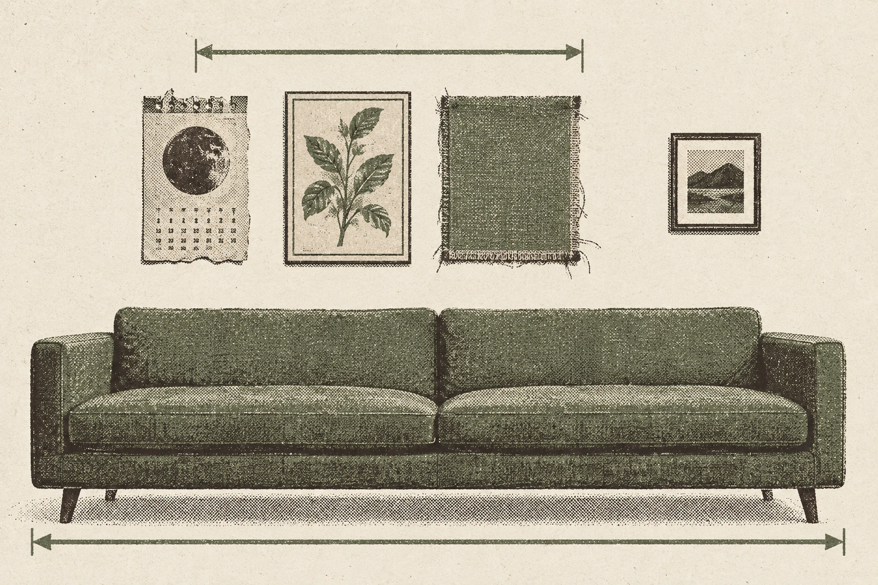
You do not need a painting. You need one flat thing with three colors in it that you chose. A page torn out of a large format calendar. A plate from an old book. An offcut of fabric stretched over a frame. A photograph you took, printed big. A patterned rug, which is a painting you walk on.
The size matters more than the source. Art over a sofa wants to be two thirds to three quarters of the width of the furniture under it, which on a standard 84 in sofa is 56 to 63 in of picture. One piece at 40 by 60 in does it. Two at 30 by 40 in hung portrait with a 2 to 3 in gap gives you 63 in and costs less.
Hang it 6 to 8 in above the sofa back and let the sofa set the height. Where you sit, a center around 50 to 54 in works better than the 57 to 60 in you would use in a hall.
What to skip: the set of nine matching prints sold as a gallery wall. Nine versions of the same two colors is not a palette, it is one color and a lot of frames, and there is nothing in it to read.
Quick answers
The questions people type
Look at the picture small, as a thumbnail or from six feet back, and name the three colors that cover the most area. Ignore the frame and the mount. Give the largest, palest of the three to the walls, the second to the sofa, rug and curtains, and the smallest, strongest one to a single piece the size of an armchair, with a cushion or two to echo it. That is a 60/30/10 split taken straight off the picture.
The one that covers the most of the picture, which is almost always the palest. Not the one you like best. Your eye weighs a color by intensity multiplied by area, so a saturated color on the walls and the floor drowns everything else in the room. In a rental the wall is usually a warm off-white already, and in most paintings the biggest area is a warm off-white too, so the two often match without you doing anything.
You can, but they stop being a scheme and start being accents. Three colors in three different amounts is the thing that reads as deliberate. If your picture has five readable colors, take the largest, the second largest, and whichever of the rest is furthest from those two, and let the other two turn up in one object each.
Give that color the thirty: floor length curtains and a big rug, the two largest things you are allowed to change. Between them they cover more visible surface than one wall does, and the landlord off-white keeps the sixty as background. If that is not enough, paper or limewash one wall rather than four, or accept that this particular picture is something you hang because you like it and build the scheme from something else.
Two thirds to three quarters of the width of the sofa, and hung 6 to 8 inches above the back. On a standard 84 inch sofa that is 56 to 63 inches of picture, so one piece at 40 by 60 inches, or two at 30 by 40 hung portrait with a 2 to 3 inch gap. Where you sit, a center around 50 to 54 inches works better than 57.
Yes, and a patterned rug is often better than a painting, because it is bigger and the colors are already proven against each other by whoever wove it. Read it the same way: squint, name the three colors with the most area, ignore the binding. The one difference is that the rug itself is already using a lot of your floor, so it counts toward the 30, not the 10.
Where next
Three things worth your next five minutes
Measured in a rental · Checked Sep 20, 2026